Here’s a stat that should bother every affiliate blogger: the average reader spends less than 60 seconds on a page before leaving. That means most people who land on your content never scroll past the third paragraph. They never see your product recommendations. They never reach the link that pays your rent.
The problem isn’t your traffic. It’s your structure.
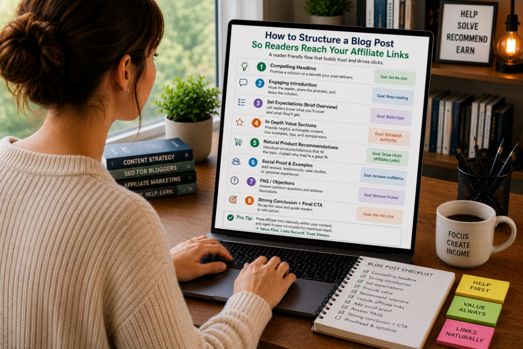
A blog post can have perfect SEO, a compelling headline, and genuinely helpful advice, and still fail to convert if the layout pushes readers away before they get to the part that matters. Structure is the invisible architecture that keeps people moving down the page, paragraph by paragraph, until they arrive at your affiliate link ready to click.
This guide covers exactly how to build that architecture, from the first sentence to the final call-to-action.
Why Structure Matters More Than You Think
Most affiliate bloggers obsess over two things: getting traffic and choosing the right products to promote. Both matter. But between “reader arrives on the page” and “reader clicks the affiliate link,” there’s a gap that structure has to fill.
Think of it this way. A reader who searches “best noise-cancelling headphones for flying” has buying intent. They want a recommendation. But if they land on your post and see a 400-word introduction about the history of noise-cancelling technology, a wall of unbroken text, and no clear path to the actual recommendations, they’ll hit the back button and find a post that respects their time.
Structure is what bridges the gap between search intent and action. It controls:
Pacing. How quickly does the reader get value? How do you balance depth with momentum?
Scannability. Can a reader skim the post and still understand the key points? Can they find the section that answers their specific question?
Emotional progression. Does the post build desire and confidence in a logical sequence? Does the reader feel more informed and more ready to buy as they move through each section?
Link context. When readers encounter your affiliate link, do they understand why you’re recommending this product? Have you earned the right to suggest they spend money?
Get these elements right, and your affiliate links stop feeling like interruptions. They feel like natural next steps.
The Opening: 150 Words to Earn 1,500 More
Your introduction has one job: convince the reader that the rest of the post is worth their time.
That’s it. You’re not setting up a thesis. You’re not providing background. You’re making a promise that the content below will solve their problem, answer their question, or help them make a better decision.
The fastest way to do this is to name their problem and hint at the solution.
Weak opening: “Choosing the right project management tool can be difficult. There are many options on the market today, and each one has different features and pricing plans.”
This says nothing. It’s generic filler that could appear on any of the 10,000 other posts about project management tools.
Strong opening: “You’ve tried three project management tools this year. None of them stuck. The first was too complex for your five-person team. The second lacked basic time tracking. The third charged enterprise prices for features you’ll never use. Here’s how to find the one that actually fits.”
The second version works because it mirrors the reader’s frustration. It tells them, “I understand your situation, and I’m going to help you fix it.” A reader who feels understood keeps scrolling.
Three principles for affiliate post introductions:
Start with the reader’s problem, not the product category. Lead with the pain point, the frustration, or the decision they’re trying to make. Save product names and feature lists for later.
Keep it under 150 words. Long introductions kill momentum. Get to the substance fast.
Drop a quick preview of your recommendation. Something like, “After testing nine tools over six months, I landed on two that are worth your money, and one that’s a clear winner for teams under 10 people.” This gives the reader a reason to keep going. They want to know which one you picked and why.
The “Quick Answer” Section: Respect Impatient Readers
Right after your introduction, include a short section that gives your top recommendation in three to five sentences. Some bloggers call this the “TL;DR,” the “quick pick,” or the “bottom line up front.”
This might sound counterproductive. If you give away your answer immediately, why would anyone read the rest?
Two reasons:
First, you capture the ready-to-buy reader. Some people have already done their research. They just want a trusted recommendation and a link. By placing your top pick near the top, you give these readers exactly what they want, and your affiliate link is right there waiting.
Second, you build trust with everyone else. When a reader sees that you’re willing to share your conclusion upfront (instead of holding it hostage until the end of a 3,000-word post), they trust you more. They’ll keep reading to understand why you made that recommendation, which means they engage with your content at a deeper level.
Here’s what a quick answer section looks like in practice:
Quick pick: For most freelancers, FreshBooks is the best invoicing tool. It’s simple to set up, handles recurring invoices automatically, and costs $17/month for up to 5 clients. If you need more advanced accounting features, check out Xero instead. I break down both options in detail below.
Notice what this does. It names a product, states who it’s for, gives a concrete price, and offers an alternative for readers with different needs. Your affiliate link sits naturally after the product name. Readers who click it convert at a high rate because they’ve already gotten a confident, specific recommendation.
Building the Body: The Section-by-Section Framework
The body of your post is where most affiliate bloggers lose readers. They dump paragraphs of information without any visual or structural cues, and the reader’s eyes glaze over.
Here’s a framework that keeps readers moving through each section, creating multiple natural opportunities for affiliate link placement along the way.
Start Each Section With a Question or Problem Statement
Every section of your post should open with something the reader cares about. A question they’re asking themselves. A problem they’re trying to solve. A concern they haven’t voiced yet.
For example, if you’re writing a section about pricing, don’t start with “Tool A costs $29/month and Tool B costs $49/month.” Start with “Can you get a capable project management tool without spending $50/month? Yes, but you’ll need to know where the budget options cut corners.”
This framing pulls the reader into the section. They want the answer. They keep reading.
Follow With the Substance (and Keep Paragraphs Short)
After your opening hook, deliver the actual information. Compare prices. Explain features. Share your experience. This is where you do the real work of earning the reader’s trust.
But watch your formatting. Long, dense paragraphs are the number one structural reason readers abandon blog posts. On a desktop screen, a paragraph that runs past five or six lines starts to feel like work. On mobile (where more than half your readers probably are), even four lines can feel heavy.
Rules for body paragraphs in affiliate content:
- Cap paragraphs at three to four sentences. If you need to say more, start a new paragraph.
- Use one idea per paragraph. Don’t pack a pricing comparison and a feature breakdown into the same block of text.
- Break up long sections with subheadings, bold text, or bullet points. Give the reader’s eyes somewhere to land.
End Each Section With a Micro-Recommendation
This is the structural trick that most affiliate bloggers miss. At the end of each section (pricing, features, ease of use, support), include a one-to-two sentence recommendation specific to that category.
For example, at the end of a pricing section: “If budget is your top priority, Tool A gives you the most features per dollar. Tool B only makes sense financially if you need its advanced reporting.”
These micro-recommendations serve two purposes. They give you a natural place to insert an affiliate link (“check Tool A’s current pricing here”). And they help the reader build a mental scorecard as they move through the post. By the time they reach your final recommendation, they’ve already seen the reasoning behind it, section by section.
Strategic Affiliate Link Placement
Where you place your affiliate links matters as much as how many you include. Too few, and readers who are ready to buy can’t find the link. Too many, and the post feels like a minefield of sales pitches.
Here’s a placement strategy that balances visibility with trust:
First Link: In the Quick Answer Section
Your earliest affiliate link should appear in the quick answer at the top of the post. This catches readers who are ready to act immediately. Keep it clean. One link per product mentioned, attached to the product name or a short CTA like “try it free.”
Second and Third Links: At Section-End Recommendations
Place links at the end of your two or three most persuasive sections. These are the sections where you’ve just demonstrated a product’s strength (best pricing, best feature set, easiest setup). The reader has just absorbed a compelling argument, and the link offers them a way to act on it.
Fourth Link: In the Final Recommendation
Your conclusion should include a clear, confident recommendation with a link. This is for readers who’ve consumed the entire post and are now ready to decide.
Where NOT to Place Links
In the introduction. You haven’t earned trust yet. A link in the first paragraph signals that the post exists to sell, not to help.
In every paragraph. Affiliate links lose power through repetition. If readers see a link every 100 words, they start ignoring all of them.
Attached to negative statements. Don’t link a product name when you’re discussing its weaknesses. “Tool B’s customer support is slow [affiliate link]” creates a bizarre disconnect. Why would the reader click a link right after you told them the product has problems?
In image captions without context. A random product image with an affiliate link underneath it feels like a banner ad. Readers have been trained to ignore those.
The Comparison Table: Your Highest-Converting Element
If there’s one structural element that consistently drives affiliate clicks, it’s a well-built comparison table.
Why? Because tables compress complex information into a format that readers can process in seconds. A reader who might skip three paragraphs of text will study a table that directly compares the features they care about.
Here’s what makes a comparison table convert:
Limit columns to three or four products. More than that and the table becomes too wide to read on mobile. If you’re covering more products, split them into multiple tables or use a tiered approach (budget picks, mid-range picks, premium picks).
Use specific values, not ratings. “14-day free trial, no credit card” is more useful than “4.5/5 stars.” Readers trust concrete details. Stars and ratings feel arbitrary.
Highlight your top pick. Use a subtle visual indicator (a “Best Overall” badge, bold text, a different background color) to draw the eye to your recommended option. This isn’t deceptive. You’ve spent the entire post explaining why this product earned that distinction.
Place the table after your introduction and quick answer, but before the detailed breakdown. This position catches skimmers who scroll past the intro looking for something visual and scannable. Many of your conversions will come from readers who glance at the table, find it persuasive, and click through without reading the full breakdown.
Include a CTA column. The rightmost column of your table should contain a short CTA for each product: “Try Free,” “See Pricing,” or “View Deal.” Make these link to your affiliate URLs.
Subheadings That Pull Readers Down the Page
Subheadings are not labels. They’re mini-headlines, and they need to work almost as hard as your main title.
Most bloggers use flat, descriptive subheadings: “Pricing.” “Features.” “Customer Support.” These tell the reader what the section is about, but they don’t give anyone a reason to actually read it.
Compare these:
- Flat: “Pricing Comparison”
- Engaging: “Pricing: Can You Get Real Value Under $20/Month?”
- Flat: “Ease of Use”
- Engaging: “Setup Time: I Had One Tool Running in 11 Minutes”
- Flat: “Customer Support”
- Engaging: “What Happens When Something Breaks at 11 PM”
The engaging versions create curiosity. They promise a specific insight or story. A reader who’s skimming the post (and most readers skim) is far more likely to stop and read a section that poses a question they want answered.
Write every subheading as if it needs to earn the reader’s attention all over again. Because it does.
The Power of Visual Breaks
Dense text is the enemy of affiliate conversions. When a reader encounters a wall of words, their brain makes a snap judgment: “This looks like a lot of work.” And they leave.
Visual breaks are the structural tool that prevents this. They give the reader’s eyes rest points, create a sense of forward progress, and make the post feel shorter than it actually is.
Effective visual breaks include:
Screenshots and annotated images. If you’re reviewing a tool, show it in action. A screenshot of a dashboard, an interface, or a specific feature does more persuasive work than three paragraphs describing it. Annotate the screenshot with arrows or callouts pointing to the features you’re discussing.
Pull quotes or callout boxes. Highlight a key insight, a surprising statistic, or a one-sentence recommendation in a styled callout box. These draw the eye and break up the text flow.
Bullet and numbered lists. Any time you’re presenting three or more related items (features, pros, cons, steps), use a list instead of a paragraph. Lists are faster to scan and easier to remember.
White space. Don’t underestimate the power of simply leaving space between sections. Generous spacing between paragraphs and sections makes the post feel more breathable and less intimidating.
Embedded video. If you have a video review or demonstration, embed it within the relevant section. Some readers prefer watching to reading, and a video keeps them on the page longer (which is good for both SEO and conversion rates).
Pacing: The Rhythm of Persuasion
Great affiliate content has a rhythm. It alternates between different types of content to maintain the reader’s interest and energy.
Think of it like a conversation. If someone talked at you in a monotone for 10 minutes straight, you’d tune out. But if they mixed stories with data, questions with answers, and quick hits with deeper explanations, you’d stay engaged.
Here’s a pacing pattern that works:
Short insight → Supporting detail → Example → Micro-recommendation.
For instance:
Short insight: “The biggest difference between these two tools isn’t features. It’s philosophy.”
Supporting detail: “Tool A is built for people who want full control. Every workflow, notification, and dashboard is customizable. Tool B takes the opposite approach. It makes decisions for you, which means faster setup but less flexibility.”
Example: “When I set up Tool B for a client project last month, I had invoices going out within 20 minutes. The same setup in Tool A took me nearly two hours because I wanted to customize the invoice template, payment terms, and automated reminders.”
Micro-recommendation: “If speed matters more than control, Tool B saves you real time. Try it free here.”
This pattern keeps things moving. The reader never gets stuck in a long stretch of any single content type.
The Conclusion That Converts
Your conclusion is your last chance to turn a reader into a click. Don’t waste it with empty phrases like “both tools are great options” or “it really comes down to personal preference.”
Those non-conclusions frustrate readers. They came to your post for guidance. Give it to them.
A high-converting conclusion does three things:
Restates the recommendation clearly. “For freelancers and small teams, FreshBooks is the better choice. It’s simpler, cheaper, and handles everything a small operation needs without the learning curve of Xero.”
Addresses the most common objection. What’s the one thing that might stop a reader from clicking? Name it and counter it. “The most common concern I hear is that FreshBooks is too basic. It’s true that it can’t match Xero’s advanced accounting features. But if you’re not a trained accountant, you’ll never use those features anyway, and you’ll pay extra for them every month.”
Makes the next step effortless. Tell the reader exactly what to do and what will happen. “You can start a free trial of FreshBooks here. No credit card required. You’ll have your first invoice template set up in about 10 minutes.”
Notice the specificity. “No credit card required” removes a friction point. “About 10 minutes” sets an expectation. These small details reduce the mental effort of clicking, which increases the probability that readers follow through.
Mobile Structure: Half Your Readers Are on a Phone
If your blog post looks great on a 27-inch monitor but falls apart on a phone screen, you’re losing conversions from a massive chunk of your audience.
Mobile readers behave differently from desktop readers:
- They scroll faster.
- They have less patience for long paragraphs.
- They’re more likely to tap a link impulsively (which can work in your favor).
- They abandon posts that are hard to read on a small screen.
Structural adjustments for mobile:
Shorter paragraphs. What looks like three lines on desktop becomes six lines on a phone. Keep paragraphs to two or three sentences maximum.
Larger, tappable CTAs. Text links are hard to tap accurately on mobile. Use buttons or clearly formatted CTA text with enough spacing around it that readers don’t accidentally tap the wrong thing.
Front-loaded sections. Put the most persuasive information at the beginning of each section. Mobile readers are more likely to scroll past the end of a section, so don’t save your best points for last.
Test your table formatting. Comparison tables that look perfect on desktop often overflow or become unreadable on mobile. Test your tables on an actual phone, and consider using a responsive table plugin or converting wide tables into stacked card layouts for mobile.
Internal Linking: Keep Readers in Your Ecosystem
Smart internal linking serves your affiliate strategy in two ways. It keeps readers on your site longer (exposing them to more affiliate links across multiple posts). And it builds topical authority, which helps your content rank higher in search results.
Where to place internal links within your post structure:
In the introduction. If you’ve written a related guide that provides background information, link to it early. “Not sure whether you need a project management tool at all? Read my guide on when spreadsheets stop being enough.”
In section transitions. When you move from one topic to another, internal links feel natural. “I covered email automation features in depth in my ConvertKit review, so I’ll focus on deliverability here.”
In the “who should choose what” section. If you’ve reviewed each product individually, link to those full reviews. “For a deeper look at FreshBooks, including setup walkthrough and template examples, see my full FreshBooks review.”
Each internal link extends the reader’s session on your site and creates additional touchpoints for affiliate conversions.
Content-Length Sweet Spot for Affiliate Posts
There’s no magic word count, but there is a structural principle: your post should be exactly as long as it needs to be to build enough trust and provide enough information for the reader to click with confidence. Not a paragraph longer.
Practical guidelines:
Single product reviews: 1,500 to 2,500 words. Enough to cover features, pricing, pros, cons, and alternatives without padding.
Two-product comparisons (X vs Y): 2,000 to 3,500 words. You need space to fairly evaluate both options across multiple criteria.
Roundup posts (best tools for X): 3,000 to 5,000 words, depending on how many products you include. Aim for 300 to 500 words per product, with additional space for introductions, comparison tables, and conclusions.
Buyer’s guides: 3,500 to 5,000 words. These need to educate the reader on what to look for before making recommendations.
The common mistake is writing long posts for the sake of SEO. Yes, longer content tends to rank better. But if 40% of your word count is filler, padding, or repetition, readers will notice. They’ll skim past your affiliate links on their way to the back button.
Every section should pass this test: “Does this section make the reader more likely to click my affiliate link?” If the answer is no, cut it or rewrite it.
A Template You Can Use Today
Here’s a plug-and-play structure you can apply to your next affiliate post:
1. Title (includes primary keyword and signals a clear benefit)
2. Introduction (100-150 words, names the reader’s problem, previews the solution)
3. Quick Answer / Top Pick (3-5 sentences, names your recommendation, includes first affiliate link)
4. Comparison Table (side-by-side overview of all products, includes CTA links)
5. Detailed Breakdown Section 1 (most persuasive category first, e.g., pricing or ease of use)
- Section hook → substance → example → micro-recommendation with link
6. Detailed Breakdown Section 2 (second most persuasive category)
- Same pattern
7. Detailed Breakdown Section 3-5 (remaining categories)
- Same pattern
8. Who Should Choose What (match reader profiles to specific products, with links)
9. Conclusion and Final Recommendation (clear pick, objection handling, frictionless CTA)
10. FAQ Section (2-4 common questions, helps with SEO and captures featured snippets)
This structure works because it creates multiple entry points for different types of readers. Skimmers get the quick answer and table. Deep readers get the full breakdown. Everyone gets clear recommendations with well-placed links.
The Mistakes That Kill Conversions
Even with the right structure, small errors can sabotage your results:
Burying the lead. If readers have to scroll through 800 words before they see a product name, you’ve lost the impatient half of your audience. Get to the recommendations early.
Using generic CTAs. “Click here” and “learn more” are invisible to readers who’ve seen them a thousand times. Specific CTAs like “Start your free 14-day trial” or “See the current price on Amazon” perform measurably better.
Forgetting to update. A blog post that recommends a product at $29/month when it now costs $49/month destroys credibility. Set quarterly reminders to check pricing, features, and availability for every product in your affiliate posts.
Ignoring page speed. A post that takes four seconds to load loses roughly 25% of visitors before they see a single word. Compress images, minimize scripts, and choose a fast hosting provider. Structure can’t help readers who never see the page.
Making the post all about you. Sharing personal experience builds trust. But there’s a line between “I tested this tool for my freelance business” and a 500-word autobiography that delays the information the reader came for. Keep personal stories short and directly relevant to the product being discussed.
Measuring What Your Structure Actually Does
After publishing, track these metrics to understand whether your structure is working:
Scroll depth. Use a tool like Hotjar or Microsoft Clarity to see how far readers scroll. If most people stop at 30% of the page, your structure is losing them before they reach your main recommendations.
Click-through rate on affiliate links. Track clicks on each link placement (quick answer, table, section-end, conclusion). This tells you which structural positions convert best for your audience.
Time on page. Higher time on page generally means readers are engaging with your content instead of bouncing. If time is low but traffic is high, your structure needs work.
Bounce rate. A high bounce rate combined with low time on page means readers are leaving immediately. This usually points to a problem with your introduction or above-the-fold experience.
Use this data to iterate. If your comparison table gets twice as many clicks as your in-text links, invest more effort in making your tables compelling. If readers consistently drop off at a specific section, restructure or shorten that section.
Building a Structure That Lasts
The structural principles in this guide aren’t trends. They’re based on how people read online, which hasn’t changed much in 20 years. People skim. People want answers fast. People respond to specificity and clarity. People click when they feel confident in their decision.
Build your affiliate posts around these behaviors, and you’ll create content that performs regardless of algorithm updates, design trends, or shifts in your niche.
Start with your next post. Map out the structure before you write a single paragraph. Decide where your affiliate links will go and what trust-building work each section needs to do before the reader encounters them. Then write to the structure.
The difference between an affiliate post that earns $5/month and one that earns $500/month is rarely the product or the traffic. It’s the path the reader takes through your content, and whether that path leads them, naturally and confidently, to click.