You open a stock chart for the first time and it looks like an EKG machine having a bad day. There are colored bars, squiggly lines, numbers everywhere, and a timeline at the bottom that somehow makes time feel more complicated than it should be.
You close the tab. You tell yourself you’ll learn it later. Later turns into never.
This happens to almost everyone. Stock charts look intimidating because they pack a lot of information into a small space. But here’s the thing: you don’t need to understand all of it. Not even close. A handful of concepts will get you reading charts with confidence, and the rest is just detail you can pick up over time.
This guide strips away the jargon and walks you through stock charts the way someone should have explained them from the start: one piece at a time, in plain language, with zero assumptions about what you already know.
What a Stock Chart Is Actually Telling You
Before we break down the individual components, let’s zoom out. A stock chart is a visual record of a fight between buyers and sellers.
Every tick on a chart represents a transaction where someone decided to buy at a price and someone else decided to sell at that same price. When more people want to buy than sell, the price goes up. When more people want to sell than buy, the price goes down.
That’s all a stock chart shows. Buying pressure versus selling pressure, plotted over time.
Once you internalize this, charts stop looking like abstract noise and start telling a story. Prices rising? Buyers are in control. Prices falling? Sellers have the upper hand. Prices moving sideways? Neither side can gain ground.
Everything else on the chart, the indicators, the patterns, the colored bars, is just a different way of measuring that same tug-of-war.
The Three Chart Types (and Which One to Focus On)
Most charting platforms let you switch between three main chart types. Here’s what each one does and why you should care about exactly one of them right now.
Line Charts
A line chart connects the closing price of each period (day, week, hour) with a single continuous line. It’s the simplest way to visualize a stock’s direction over time. You see the general trend instantly: up, down, or sideways.
Line charts are useful for getting a quick, clean view of the big picture. But they hide a lot of information. You can’t see what happened during each trading day, only where the price ended up.
Bar Charts (OHLC)
A bar chart shows four data points for each period: the open, high, low, and close (OHLC). Each period appears as a vertical line with small horizontal ticks. The left tick marks the opening price. The right tick marks the closing price. The top of the vertical line shows the day’s high, and the bottom shows the low.
Bar charts contain more information than line charts but can look cluttered, especially when you’re zoomed in on a busy time period.
Candlestick Charts
Candlestick charts display the same four data points as bar charts (open, high, low, close) but present them in a format that’s much easier to read at a glance.
Each period shows up as a “candle” with a rectangular body and thin lines extending above and below (called wicks or shadows). If the price closed higher than it opened, the body is typically green or white (a bullish candle). If the price closed lower than it opened, the body is red or black (a bearish candle).
This is the chart type to learn. Candlestick charts give you the most information in the most readable format. They’re the standard in almost every trading platform, financial website, and investment app. Once you learn to read them, you can read charts anywhere.
For the rest of this guide, we’re working with candlestick charts.
How to Read a Single Candlestick
Every candlestick tells you four things about a specific time period:
The open: Where the price started when trading began for that period.
The close: Where the price ended when trading closed for that period.
The high: The highest price reached during that period.
The low: The lowest price reached during that period.
The body of the candle (the thick rectangular part) shows the range between the open and the close. The wicks (the thin lines above and below the body) show how far the price traveled beyond the open and close.
A green candle means the close was higher than the open. Buyers won that period. The bottom of the body is the open, and the top of the body is the close.
A red candle means the close was lower than the open. Sellers won that period. The top of the body is the open, and the bottom of the body is the close.
A candle with a long body tells you there was strong momentum in one direction. Buyers or sellers were firmly in control.
A candle with a short body tells you the open and close were near each other. Neither side made much progress. Indecision.
A candle with long wicks tells you the price swung significantly during the period but got pulled back. Long upper wicks suggest sellers pushed the price back down from its highs. Long lower wicks suggest buyers stepped in and pushed the price back up from its lows.
A candle with almost no wicks means the open and close were near the high and low. One side dominated the entire session without much resistance.
That’s it. That’s how you read a single candlestick. Practice looking at a few charts and reading individual candles. Ask yourself: who won this day, buyers or sellers? How convincing was the victory?
Timeframes: Zooming In and Zooming Out
Every candlestick represents a specific time period. You choose the timeframe on your charting platform, and it changes what each candle represents:
- 1-minute chart: Each candle shows one minute of trading. Used by day traders watching price action in real time.
- 5-minute and 15-minute charts: Short-term views. Popular for active traders making decisions within a single trading day.
- 1-hour chart: Each candle covers one hour. Useful for swing traders looking at moves over several days.
- Daily chart: Each candle represents one full trading day. This is the most common timeframe for individual investors and the one you should start with.
- Weekly chart: Each candle covers one week. Great for seeing the bigger trend without the daily noise.
- Monthly chart: Each candle covers one month. Gives you the longest-term perspective.
Here’s a practical tip that will save you a lot of confusion: always check multiple timeframes before drawing conclusions.
A stock might look like it’s in a strong uptrend on the daily chart, but zoom out to the weekly chart and you realize it’s just bouncing within a larger downtrend. A stock might look terrible on a 15-minute chart but perfectly healthy on the daily.
Start with the daily chart for your primary view. Then check the weekly chart for context. This two-timeframe approach gives you both the detail and the big picture without getting lost in minute-by-minute noise.
Volume: The Part Most Beginners Ignore (and Shouldn’t)
At the bottom of most stock charts, you’ll see a row of vertical bars. These represent volume, which is the number of shares traded during each period.
Volume is one of the most telling pieces of information on a chart, and it’s the one beginners skip over the fastest. Don’t skip it.
Volume confirms price moves. A price increase on high volume means a lot of buyers were participating. That’s a strong, credible move. A price increase on low volume means only a few people were buying. That move is less trustworthy and more likely to reverse.
Think of it this way: if ten people in a crowd start walking north, it doesn’t mean much. If ten thousand people start walking north, something real is happening. Volume tells you the size of the crowd behind a price move.
Here’s what to watch for:
Rising price + rising volume = strong bullish signal. Buyers are showing up in increasing numbers. The move has conviction.
Rising price + declining volume = warning sign. The price is going up, but fewer and fewer people are participating. The move is losing steam.
Falling price + rising volume = strong bearish signal. Sellers are active and aggressive. The downward pressure is real.
Falling price + declining volume = potential exhaustion. Selling may be running out of energy. A reversal could be forming.
Volume spikes (unusually tall bars compared to recent history) often mark turning points. A sudden spike in volume after a long decline can signal that sellers have exhausted themselves and buyers are stepping in. A spike after a long rally can indicate that the last wave of buyers has entered and the move is running out of fuel.
You don’t need to memorize volume formulas or calculations. Just train your eye to notice the relationship between price candles and the volume bars beneath them. Are they telling the same story, or contradicting each other?
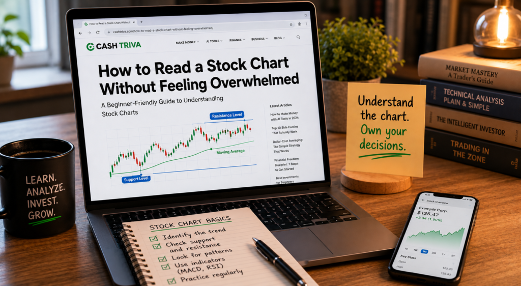
Support and Resistance: Where Prices Tend to Stall
If you learn nothing else from this guide beyond candlesticks and volume, learn support and resistance. These two concepts will change the way you look at every chart.
Support
Support is a price level where a stock has historically stopped falling and bounced back up. It acts like a floor. When the price approaches a support level, buyers tend to step in because they see it as a good deal, and the increased buying pressure pushes the price back up.
You identify support by looking for prices where the stock has bounced multiple times. If a stock has dropped to $45 on three separate occasions over the past six months and bounced each time, $45 is a support level.
Resistance
Resistance is a price level where a stock has historically stopped rising and pulled back. It acts like a ceiling. When the price approaches resistance, sellers tend to step in because they see it as a good time to take profits, and the increased selling pressure pushes the price back down.
Find resistance the same way: look for prices where the stock has stalled or reversed on multiple occasions. If a stock has risen to $72 three times in the past year and pulled back each time, $72 is a resistance level.
Why Support and Resistance Matter
These levels help you understand where the market’s psychological boundaries are. Prices don’t move randomly. They tend to respect historical levels because traders have memory. If a stock bounced off $45 twice before, the third time it approaches $45, a lot of buyers will be watching that level and ready to buy.
When support breaks, it often becomes the new resistance. If that $45 floor cracks and the stock falls to $38, the next time it rallies back up, $45 will likely act as a ceiling. This happens because people who bought at $45 and watched the stock fall below it will be looking to sell once it returns to their purchase price (to “break even”).
When resistance breaks, it often becomes the new support. If the stock finally pushes through $72, that level will likely act as a floor on the next pullback.
Draw horizontal lines at support and resistance levels on your charts. You’ll start seeing how the price respects these levels over and over again. It won’t be perfect every time, but it will be right often enough to be useful.
Moving Averages: Smoothing Out the Noise
Individual candlesticks can be noisy. One bad day doesn’t mean the trend has changed. One good day doesn’t mean a recovery has started. Moving averages help you see through the daily chop and identify the actual trend.
A moving average calculates the average closing price over a specific number of periods and plots it as a smooth line on the chart. As each new period closes, the oldest period drops off and the newest one is added, so the average “moves” with the price.
The Two Moving Averages You Should Know
The 50-day moving average (50 MA). This tracks the average closing price over the last 50 trading days. It’s a medium-term trend indicator. If the price is above the 50 MA, the medium-term trend is generally up. If the price is below it, the medium-term trend is generally down.
The 200-day moving average (200 MA). This tracks the average closing price over the last 200 trading days (roughly one year of trading). It’s a long-term trend indicator. Institutional investors, fund managers, and algorithmic trading systems all watch the 200 MA closely. When a stock is above its 200 MA, it’s generally considered to be in a long-term uptrend. Below it, a long-term downtrend.
How to Use Moving Averages
Trend confirmation. If both the 50 MA and 200 MA are sloping upward and the price is above both, the stock is in a strong uptrend. If both are sloping downward and the price is below both, the stock is in a strong downtrend.
Dynamic support and resistance. Moving averages often act as support during uptrends. In a healthy uptrend, the stock will frequently pull back to its 50 MA, bounce off it, and continue higher. During downtrends, the 50 MA and 200 MA often act as resistance, capping rallies.
The golden cross and death cross. When the 50 MA crosses above the 200 MA, it’s called a golden cross and is widely considered a bullish signal. When the 50 MA crosses below the 200 MA, it’s called a death cross and is considered bearish. These are lagging signals (they confirm a trend after it’s already started), but they’re still watched carefully because so many investors pay attention to them that they can become self-fulfilling.
Don’t overthink moving averages. Start by adding just the 50 MA and 200 MA to your charts. Look at where the price is relative to these lines. Over time, you’ll develop an intuition for how stocks behave around their moving averages.
Seven Candlestick Patterns Worth Recognizing
You could spend years studying candlestick patterns. Entire textbooks have been written about them. But you don’t need to memorize dozens of exotic formations to get value from pattern recognition. Here are the seven that show up most often and provide the most reliable signals.
1. Doji
A doji has a very small body (open and close are nearly identical) with wicks extending above and below. It represents indecision. Neither buyers nor sellers could maintain control.
A doji after a strong uptrend or downtrend can signal that the momentum is fading and a reversal might be coming. On its own, a doji is just a pause. Combined with other signals (like appearing at a resistance level on high volume), it becomes much more meaningful.
2. Hammer
A hammer appears at the bottom of a downtrend. It has a small body at the top and a long lower wick (at least twice the length of the body), with little or no upper wick.
The story it tells: during the session, sellers pushed the price down significantly, but buyers came roaring back and pushed it back up near the open. The long lower wick shows that buyers are stepping in aggressively. A green hammer is slightly more bullish than a red one, but both are considered positive signals after a decline.
3. Inverted Hammer
An inverted hammer appears at the bottom of a downtrend. It has a small body at the bottom and a long upper wick, with little or no lower wick. It looks like a hammer flipped upside down.
It signals potential buying interest. Buyers tried to push the price up during the session, and while sellers pulled it back down by the close, the attempt itself shows that buying pressure is emerging.
4. Engulfing Pattern
A bullish engulfing pattern is a two-candle formation where a small red candle is followed by a larger green candle that completely “engulfs” the previous candle’s body. It signals that buyers have overwhelmed sellers and a reversal may be underway.
A bearish engulfing pattern is the opposite: a small green candle followed by a larger red candle that engulfs it. Sellers have taken over.
Engulfing patterns are most significant when they appear at support or resistance levels and are confirmed by high volume.
5. Morning Star
A morning star is a three-candle pattern that appears at the bottom of a downtrend:
- A long red candle (sellers in control)
- A small-bodied candle that gaps down (indecision, the selling pressure is weakening)
- A long green candle that closes well into the body of the first red candle (buyers have taken over)
This pattern suggests that sellers ran out of energy, a period of indecision followed, and buyers stepped in to reverse the trend.
6. Evening Star
The evening star is the bearish mirror image of the morning star, appearing at the top of an uptrend:
- A long green candle (buyers in control)
- A small-bodied candle that gaps up (indecision at the top)
- A long red candle that closes well into the body of the first green candle (sellers have taken over)
It warns that an uptrend may be ending.
7. Shooting Star
A shooting star appears at the top of an uptrend. It has a small body at the bottom and a long upper wick, with little or no lower wick. It looks like an inverted hammer, but the context is different: it appears after prices have been rising.
The story: buyers pushed the price higher during the session, but sellers fought back and drove it down near the open. The long upper wick shows that sellers are active at higher prices. It’s a warning that the uptrend may be losing momentum.
Trend Lines: Drawing the Direction
A trend line is one of the simplest tools in chart analysis, and you can draw one yourself in about three seconds.
Uptrend line: Connect two or more rising lows (the lowest points of pullbacks during a rising market) with a straight line. This line shows the trajectory of the uptrend. As long as the price stays above this line, the uptrend is intact. If the price breaks below it, the uptrend may be weakening.
Downtrend line: Connect two or more falling highs (the peak points of bounces during a falling market) with a straight line. This shows the trajectory of the downtrend. As long as the price stays below this line, the downtrend is intact.
Guidelines for drawing useful trend lines:
- You need at least two touch points to draw a line, but three or more make it much more reliable
- The more times a trend line has been tested and held, the more significant it becomes
- When a well-established trend line breaks, it’s a meaningful signal. Pay attention
- Don’t force a trend line to fit. If you have to stretch or bend it to touch the price points, it’s not a real trend line
Trend lines work because they visualize the rate at which buyers or sellers are willing to step in. An uptrend line shows that buyers are consistently willing to buy at progressively higher prices. When that line breaks, it means buyers are no longer as aggressive, and the dynamic has shifted.
Putting It All Together: Reading a Chart From Start to Finish
Now let’s combine everything into a practical process. When you open a stock chart, here’s a step-by-step approach that keeps things organized:
Step 1: Check the big picture. Pull up the weekly chart and identify the overall trend. Is the stock trending up, down, or sideways over the past year? Note the major support and resistance levels. This gives you context.
Step 2: Switch to the daily chart. Now look at the recent price action. What have the last 20 to 30 candles been doing? Are they making higher highs and higher lows (uptrend), lower highs and lower lows (downtrend), or bouncing between the same levels (range)?
Step 3: Check the moving averages. Where is the price relative to the 50 MA and 200 MA? Are the moving averages sloping up, down, or flat? Is there a recent golden cross or death cross?
Step 4: Look at volume. Is volume increasing or decreasing? Do recent volume spikes correspond with meaningful price moves? Is the current price action being confirmed by volume?
Step 5: Identify nearby support and resistance. Where are the nearest levels where the price is likely to stall? Is the stock approaching a support level where it might bounce, or a resistance level where it might pull back?
Step 6: Look for candlestick patterns. Are there any recognizable formations at key levels? A hammer at support? An engulfing pattern at resistance? A doji after a long run-up?
Step 7: Form a view. Based on everything you’ve observed, does this stock look like it’s in a strong position, a weak position, or a neutral one? You’re not predicting the future. You’re assessing the current situation and making an informed decision about probabilities.
This entire process takes two to three minutes once you’ve practiced it a few times. You don’t need to write a research paper. You’re scanning, assessing, and deciding.
The Mistakes That Trip Up Every Beginner
Overloading the chart with indicators. Your charting platform probably offers 50 or more indicators: RSI, MACD, Bollinger Bands, Stochastic Oscillator, Fibonacci levels, and more. Beginners often add five or six indicators at once and end up with a chart that looks like a Jackson Pollock painting. Each indicator gives slightly different signals, and the conflicting information creates paralysis.
Start with candlesticks, volume, and two moving averages (50 and 200). That’s it. You can add one new indicator every few months as you get comfortable. Most experienced traders use three to four indicators at most.
Looking for patterns that aren’t there. Once you learn about candlestick patterns, you’ll start seeing them everywhere. Your brain wants to find patterns, it’s wired that way. But not every formation is meaningful. A hammer at a random point in the middle of a range is far less significant than a hammer at a well-tested support level with a volume spike.
Context determines whether a pattern matters. Always ask: where is this pattern appearing? Is it at a meaningful support or resistance level? Is volume confirming it?
Confusing correlation with prediction. A chart shows you what has happened and what’s happening now. It does not tell you what will happen next with certainty. No pattern has a 100% success rate. No indicator is right every time. Charts give you probabilities, not guarantees.
The best chart readers are probabilistic thinkers. They say, “Based on this setup, there’s a higher probability the price moves up than down.” They don’t say, “The chart guarantees this stock is going to $100.”
Ignoring the broader market. Individual stock charts don’t exist in a vacuum. If the overall market is in a sharp decline, even the strongest-looking stock chart can break down. Always glance at the S&P 500 or Nasdaq chart before drawing conclusions about individual stocks. A rising tide lifts most boats, and a falling tide sinks them.
Using short timeframes for long-term decisions. If you’re investing for the next five years, a 5-minute chart is completely irrelevant. Match your chart timeframe to your investment timeframe. Long-term investors should focus on daily and weekly charts. Short-term traders can look at intraday charts. Using the wrong timeframe for your goals will lead to bad decisions.
Free Tools for Reading Charts
You don’t need expensive software to read stock charts. Several excellent platforms offer full-featured charting for free:
TradingView. The most popular free charting platform available. Clean interface, extensive customization, and a large community of traders sharing chart analysis. The free version is more than enough for beginners.
Yahoo Finance. Basic charting with all the features you need to get started. Not as powerful as TradingView, but simple and accessible.
Google Finance. Minimalist and clean. Good for quick checks and big-picture views, though it lacks advanced tools.
Your brokerage platform. Fidelity, Schwab, TD Ameritrade (thinkorswim), and most other brokers include charting tools in their platforms. Thinkorswim, in particular, is one of the most powerful charting platforms available, and it’s free to use with a TD Ameritrade/Schwab account.
Start with TradingView if you want the best free experience. Set up a free account, type in a stock ticker, add the 50 MA and 200 MA, and start practicing.
A 30-Day Practice Plan for Building Chart-Reading Confidence
Reading charts is a skill, and like any skill, it develops through repetition. Here’s a structured plan to build your confidence over the first month:
Days 1 through 7: Candlesticks and timeframes. Pick five well-known stocks (Apple, Amazon, Tesla, Microsoft, and Google work well because they’re liquid and heavily traded). Pull up the daily chart for each one. Practice reading individual candlesticks. For each candle, ask: who won today, buyers or sellers? How strong was the move? What do the wicks tell me? Switch between daily and weekly timeframes and notice how the same stock tells a different story at different zoom levels.
Days 8 through 14: Volume. Now look at the volume bars beneath your charts. Start noticing the relationship between price and volume. Find days where the price made a big move. Was volume high? Find days where volume spiked. What happened to the price? Train your eye to spot divergences: price going up while volume declines, or vice versa.
Days 15 through 21: Support, resistance, and moving averages. Add the 50 MA and 200 MA to your charts. Identify the nearest support and resistance levels on each chart. Draw horizontal lines at those levels. Watch how the price behaves when it approaches the moving averages or touches support/resistance levels. Start connecting the dots between price, volume, and these levels.
Days 22 through 30: Patterns and full analysis. Start scanning for the candlestick patterns covered in this guide. When you spot one, note the context: where did it appear? Was it at support or resistance? What did volume look like? Practice the full seven-step chart-reading process outlined earlier. By the end of the month, you should be able to open any stock chart and form a basic view within two to three minutes.
What Comes Next
This guide covered the fundamentals: candlestick anatomy, volume, support and resistance, moving averages, patterns, trend lines, and a systematic approach to reading a chart. That’s a lot of ground, and it’s enough to make you a competent chart reader.
When you’re ready to go deeper, here’s what to explore next:
- Relative Strength Index (RSI): Measures whether a stock is overbought or oversold. Useful for timing entries and exits.
- MACD (Moving Average Convergence Divergence): Tracks momentum shifts. Helpful for spotting when a trend is accelerating or decelerating.
- Bollinger Bands: Show volatility by plotting bands above and below a moving average. Useful for identifying when a stock’s price has stretched too far in one direction.
- Fibonacci retracement levels: Identify potential reversal points during pullbacks. Widely used by technical traders.
Add one new concept at a time. Practice it for a few weeks before moving on. Building a layered understanding is far more effective than trying to absorb everything at once.
The biggest thing to remember: stock charts are not crystal balls. They’re communication tools. They tell you what the market is doing right now and what it has done in the past. What happens next involves probabilities, not certainties.
But a well-read chart, combined with a clear investment plan and disciplined risk management, gives you a significant edge over the investor who buys and sells based on headlines, tips from friends, or gut feelings.
Open a chart. Start reading. The first few dozen times will feel clumsy. After a hundred, it’ll feel natural. After a thousand, you’ll wonder how you ever looked at a stock without one.